Day 3 - Readable type
Housekeeping
- Reminder: Late penalty for CPNT 201 A2 is 10%/day. Submissions close after 3 days late.
- Lesson Prep has been moved to the bottom of the page.
- Schedule Correction: Friday and Monday will be DSGN 270, not CPNT 201.
- Tomorrow’s prep has been posted.
- Achievements Round 1 has been posted to Brightspace
1. Watch party!
Slides: Web typography
2. Font stacks
Sample code
Activity: Cross-browser check
In groups of 3-4, with each group having both Mac and Windows browsers available:
- Have each member load this list of web-safe font stacks in their browser;
- Compare and contrast the differences of each stack between Mac and Windows PCs.
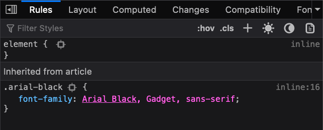
- Which font is active in your browser? Find this by Inspecting the element. The active font is underlined in the
font-familydeclaration.
- Are there noticeable differences?
Demo: Firefox cascade inspector
See: Why isn’t this CSS doing anything? by Mariam Suzanne
Key Takeaways
- Active fonts will be underlined in
font-familydeclarations; - The “Rules” panel shows declarations in decreasing order of importance;
- The declarations at the top will override the lower declarations;
- Overridden and inactive rules will be grey and crossed out:
- Look for overriding rules above the one that’s crossed out;
- Look for icons on greyed out declarations. They often give you important information on why it’s crossed out.
Lab Time
Activities
Take your Wiki content from yesterday (or come up with new content) and make your text more readable and pretty:
Define your typography triad:
- Declare your body text font using the
font-familydeclaration and on thebodytag. - Include settings for
line-height(default is1.2; try for1.5-2) and increase thefont-sizeto something larger than16px(the default on most browsers):body { font-family: Arial Black, Gadget, sans-serif; font-size: 18px; line-height: 1.6; } - Create a
.text-boxclass that setsmax-widthon a container. Centre it withmargin: auto, if desired.
- Declare your body text font using the
Declare a Display font: Declare a secondary font on your headings using a group selector:
h1, h2, h3, h4, h5, h6 {
  font-family: Palatino Linotype, Book Antiqua, Palatino, serif;
}
Get fancy: Add more visual hierarchy to your headings with one of more of the following “fancy” declarations:
font-variant: Used for setting small caps;letter-spacing: Great for spacing letters in headings;word-spacing: Rarely used but can come in handy for logos and site titles;
Responsive text: Declare your font size as a percentage of viewport width using
clamp().Custom
font-familypairings: Create two to three custom font pairings using Google Fonts with system and generic families as fallbacks.- Search: ”google font pairing”
- See: Get Started with the Google Fonts API
Icon fonts: Try adding Font Awesome Icons. Hint: it’s often easier to embed FA using CDNJS.
- Advanced: Font Awesome using pseudo-elements
Prep
Watch list
- Why isn’t this CSS doing anything? by Mariam Suzanne
Reading list
Search list
- “css selectors”
- “css cascade”
- “css specificity”
- “best google font pairings”

